Logo

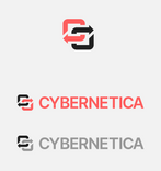
Our logo proudly represents the company’s long history. The symbol is based on the original mark created in the 1960s and depicts feedback loops. It has been optimised for modern on-screen use and paired with a wordmark set in our corporate typeface.

Download logo package

Social media profile

Only the symbol is used for social media profile pictures.

Login to access social media tool

Size and position

Clear space

Minimum clear space around the logo should be equal to symbol size.

Minimum size

The minimum height for on-screen use is 18px.
In print, the height should not be smaller than 3mm.

Logo placement and size on different formats

The logo can be placed on the upper-left or lower-right corner, depending on the application.

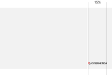
Logo size on landscape formats should be no less than 15% of the full width of the document.
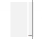
Logo size on portrait formats should be no less than 12% of the full width of the document.

Improper use

There is only one version of the logo – it is not allowed to reposition the logo elements. Don't add any text to the logo, change the colour scheme or use any new colours.

History

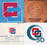
Cybernetica's logo dates back to 1970 when it was first used for the Institute of Cybernetics at the Tallinn University of Technology. The symbol was designed by Udo Ivask. Throughout the years, it has taken on different forms and variations, always retaining the initial core idea of feedback loops.

Design system