Updated on January 31, 2022 Introduction

Cybernetica builds future-proof technologies that rely on research and development. Our visual identity reflects our values and offering – it’s rational, technological and timeless.

How to use this guide

The identity guide is divided into chapters, each covering an integral part of the design system: logo, colours, typography and images. Additionally, there are in-use examples and downloadable resources for introducing or promoting Cybernetica.
Design system

Overview

Look & feel

Our visual communication reflects who we are, what we stand for and where we are heading. It also needs to convey our messages in the clearest possible way. Science and research are the foundations of our brand and design decisions should also be driven by rational thinking.

In all applications, aim to use the least amount of elements, add no superficial decorations and establish a clear information hierarchy.

Our design should always feel:

  • Rational
  • Functional
  • Clear

Brand promise

This is the value we deliver to our clients. Our visual identity is in line with the brand promise, based on timeless design principles and staying relevant in the years to come.

Future-proof technologies for secure digital societies.

Function-specific solutions

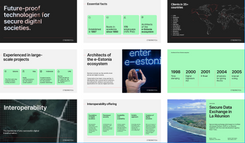
Instead of general guidelines on layout etc, we provide templates and examples for specific areas/applications.

  • marketing
  • technical presentations
  • HR